Preview
Base
Grid
Buttons
Popup
Usage
<div class="social-feed social-feed-fb" data-token="[YOUR-TOKEN]" data-social-id="123" data-options="limit:2"></div>
<div class="scroll-box" data-height="400" data-rail-color="#c3dff7" data-bar-color="#379cf4">
    <div class="social-feed social-feed-fb" data-social-id="511238532715807" data-options="limit:8" data-token="[YOUR-TOKEN]"></div>
</div>
<div class="social-feed social-feed-fb social-slider" data-social-id="511238532715807" data-options="comments:false,limit:8,arrows:true,nav:true,controls:out,type:carousel,perView:2" data-token="[YOUR-TOKEN]"></div>
<div class="social-feed social-feed-tw" data-social-id="twitter" data-options="count:5"></div>
<div class="scroll-box" data-height="400" data-rail-color="#c3dff7" data-bar-color="#379cf4">
    <div class="social-feed social-feed-tw" data-social-id="twitter" data-options="count:8"></div>
</div>
<div class="social-feed social-feed-tw social-slider" data-social-id="twitter" data-options="count:8,arrows:true,nav:true,controls:out,type:carousel,perView:2"></div>
Base
<div class="icon-links icon-social">
    <a data-social="share-facebook" class="facebook"><i class="icon-facebook"></i></a>
    <a data-social="share-twitter" class="twitter"><i class="icon-twitter"></i></a>
    <a data-social="share-linkedin" class="linkedin"><i class="icon-linkedin"></i></a>
    <a data-social="share-pinterest" class="pinterest"><i class="icon-pinterest"></i></a>
</div>
Popup
<div class="icon-links icon-links-popup icon-social">
    <i></i>
    <div>
        <a data-social="share-facebook" class="facebook"><i class="icon-facebook"></i></a>
        <a data-social="share-twitter" class="twitter"><i class="icon-twitter"></i></a>
        <a data-social="share-linkedin" class="linkedin"><i class="icon-linkedin"></i></a>
        <a data-social="share-pinterest" class="pinterest"><i class="icon-pinterest"></i></a>
    </div>
</div>
Installation
<link rel="stylesheet" href='themekit/css/social.css'>
<script src='themekit/scripts/social.min.js'></script>
Settings
| Name | Type | Description | ||||||||||||||||||||
|---|---|---|---|---|---|---|---|---|---|---|---|---|---|---|---|---|---|---|---|---|---|---|
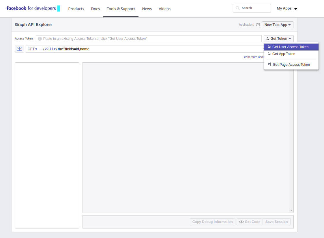
| Facebook initialization | -- |
|
||||||||||||||||||||
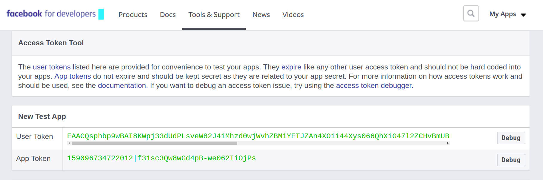
| Facebook token | -- |
|
||||||||||||||||||||
| Twitter initialization | -- |
Insert into the attribute data-social-id=""the Twitter channel name without the @. You can find the channell name from the URL of your browser.
|
||||||||||||||||||||
| Scroll box | -- |
The scroll box mode require the following script installation: <script src='themekit/scripts/slimscroll.min.js'></script> .For more details visit the scroll box page. |
||||||||||||||||||||
| Slider | -- |
The slider mode require the following script and style installation:
<script src='themekit/scripts/glide.min.js'></script>
<script src='themekit/css/glide.css'></script>
Add the class social-slider to the component and the slider options into the attribute data-options.
Add the attribute data-trigger="manual" to the component if it's inside another container.
For more details visit the slider page.
|
||||||||||||||||||||
| Facebook options | Attribute |
You can pass the plugin options directly from the component with the attribute data-options="optione:value,optione:value, ...".
To view the full options list visit the plugin documentation page.
|
||||||||||||||||||||
| Twitter options | Attribute |
You can pass the plugin options directly from the component with the attribute data-options="optione:value,optione:value, ...".
To view the full options list visit the plugin documentation page.
|
||||||||||||||||||||
| Share buttons type | CSS |
Add one of the following classes to the components to change the buttons type: icon-links-grid,icon-links-button,icon-links-popup.
|
||||||||||||||||||||
| Share buttons size | CSS |
Add the class icon-lg to the component to enlarge the icons.
Try it
Icon lg
|
||||||||||||||||||||
| Share buttons social colors | CSS |
Add the class social-colors to the component to apply the social colors to the buttons.
Use the class social-colors-hover to show the social colors only on mouse hover.
Try it
Social colors
Social colors hover
|
||||||||||||||||||||
| Share buttons URL | Attribute |
Add the attribute data-social-url="URL" to the social item to link it to a different page. By default the URL link to the current page.
|